Upgraded Look and Feel
This year we rolled out the new main Shodan website and alongside it updated the look of all websites. There were a few specific goals that we had for the new look and feel:
- Reduce page sizes. The web is becoming increasingly bloated. Lets try to keep things lean.
- Remove 3rd-party scripts that aren't necessary for the functionality of the website
- Mobile support. You should be able to access Shodan on your phone without installing an app.
- Dark mode. Ideally we wouldn't blind you if you pulled up the website at night.
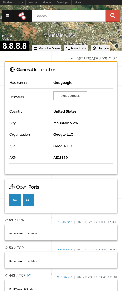
We believe that the new design system for Shodan delivers on all of the above. We optimized all of the HTML/ CSS/ Javascript to make sure it's as small as possible. With those optimizations, we were able to join the 1MB Club of websites that are less than 1MB to load. We removed Google Analytics as it isn't needed to provide website functionality and we didn't want to share traffic information with a 3rd-party. We updated every website to support small screens, including mobile devices:
And we built the new websites with support for themes! Simply go to your account settings page and select how you'd like your Shodan to look:

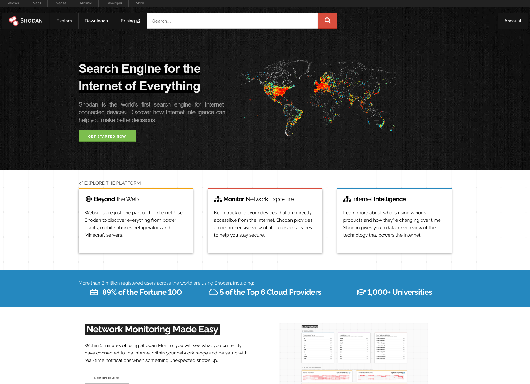
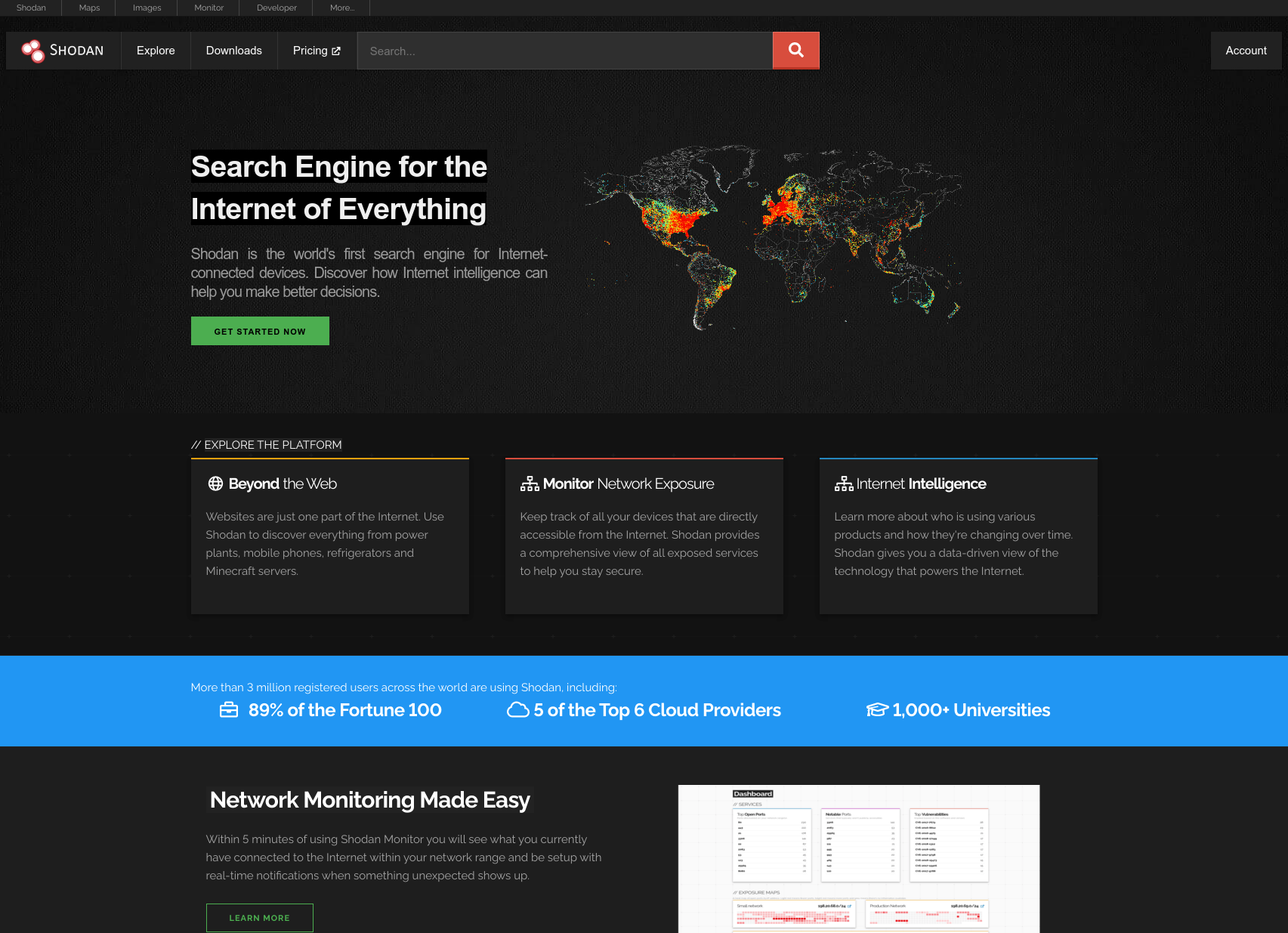
These are the themes you can choose from:
Default
Dark
Outrun
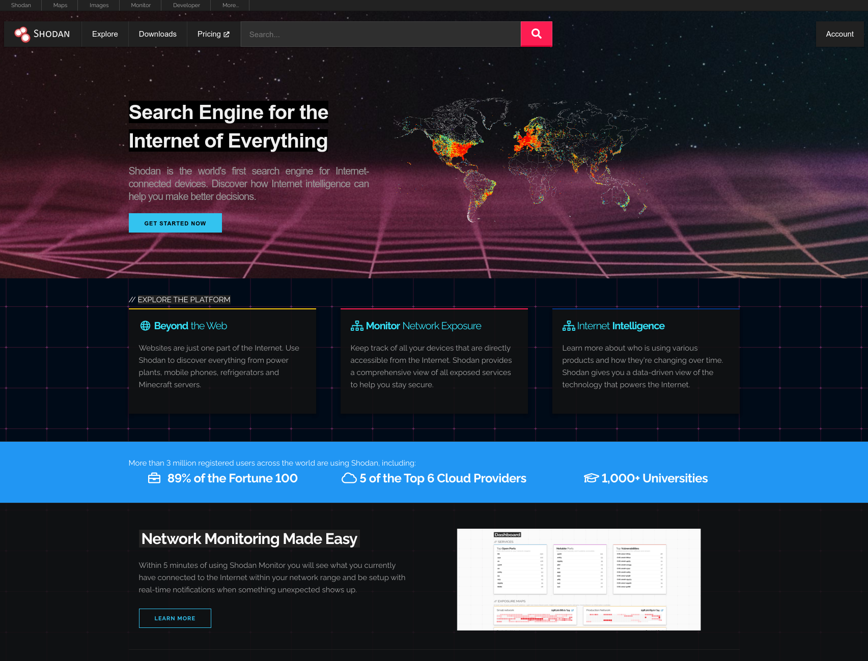
If you enjoy the outrun aesthetic you should also check out our Shodan 2000 website
Cyberpunk
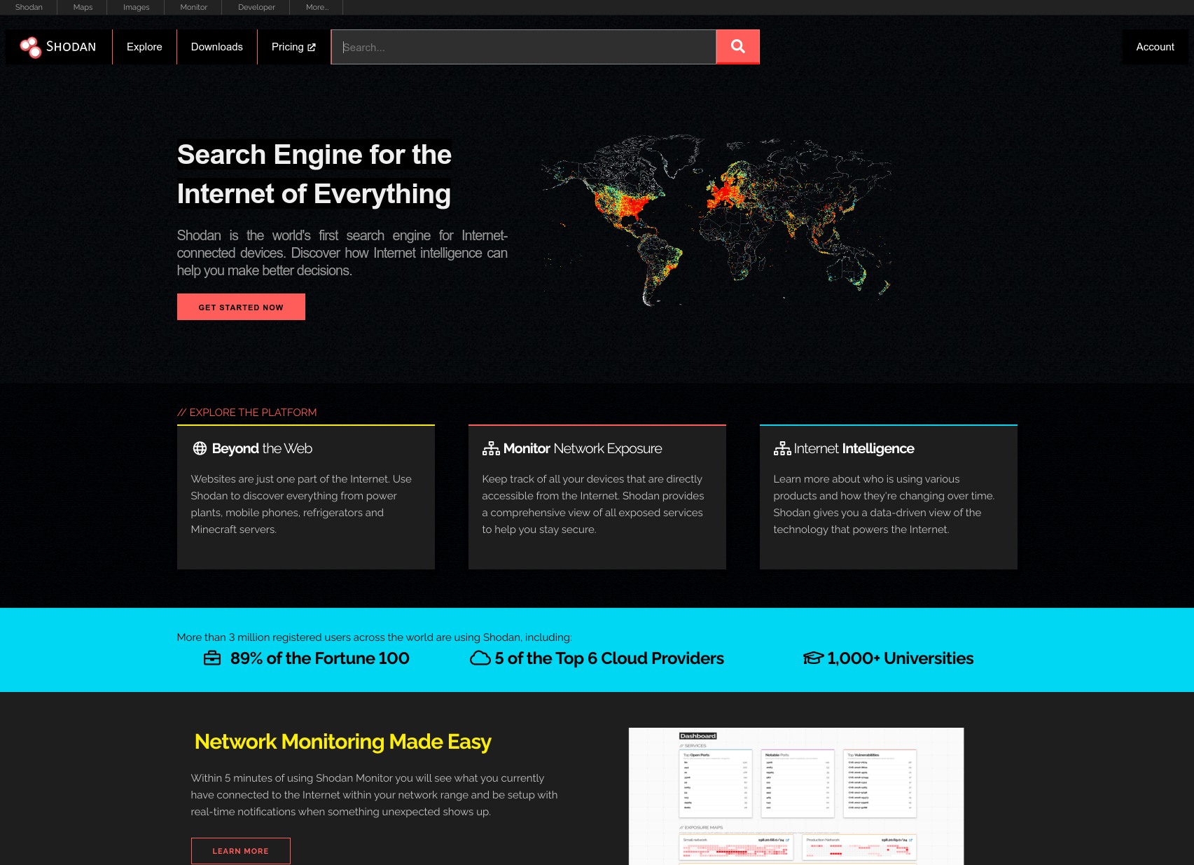
Finally, if you've configured your operating system or browser to prefer dark mode then websites such as our Help Center will automatically use the dark theme. We hope you like the new look and speed of the websites!